Make it stand out.
A guide to taking better photos of your projects.
Kyle McGill
You’ve spend hours designing your project, setting up the lathe, turning and finishing it. You’ve put so much work into the project. Now let your work do the talking, by utilising some simple and useful photography tips. This article will not make you the Annie Leibovitz of wood work photography, but it should give you some things to consider when taking your next photos to make them stand out.
Background
Before we start, there are a few things that you should know. This article has been written for those of you who have incredible work, but the photos just don’t do it justice, or for those that are just wanting to take better photos, but don’t know where to start. You don’t need expensive or sophisticated equipment, or any in-depth technical knowledge; a budget camera, or smartphone will be fine for what we are looking to achieve.
It always disappointments me to see a low resolution photo of someone’s work. Why scrimp on the data? There is a common belief that the photos will take up a large amount of space, and that it will take a long time for the webpage to open. Let’s take an average PC, laptop, (and in some cases) smartphones. They come with 500gb of memory minimum usually; the photo at the top of this page is 4.7mb. What does this mean? You’ll need about 45,000 of these photos to fill up your hard drive. Let’s say that these photos were in an imaginary (albeit it rather large) coffee table photo album, and that you took three seconds to look at each photo. You’d be sitting there for 38 hours looking at all of them. I am a keen amateur photographer, and I love wood work, but not for all the tea in China would I sit there and look at photos for 38 hours. (In 38 hours, I’d probably drink all the tea in China!) Space is not going to be an issue. Another reason people think that large photos are a problem is that they take a long time to load up a webpage. Modern computers and broadband, are well equipped to handle webpages of large size. Well, did you notice a long time to load up this article?
1. Take the highest resolution photo of your work that you can.
Nice a simple to start. Give yourself a head start by going as high as you can on quality. You can think of resolution as the detail in your photo. Make sure that your viewers can see the effort you’ve put in to ensuring that there are no visible sanding marks! You can usually find your resolution in the settings of your camera; typically the larger the number the better.

Due to the high resolution, you can see the detail on the dragonfly. If you zoom in, you can see the scales on it.
On your smart phone, it could be within your settings or within the camera application itself. Don’t scrimp on this area, as it doesn’t cost you anything.
2. Location Location Location
I am most certainly an amateur, however, I give my photos the best opportunity to shine with what I’ve got. I don’t use an expensive set up, I use what I have available to me. I’ll be explaining how I’ve approached this, from my front room, as we go through the article.
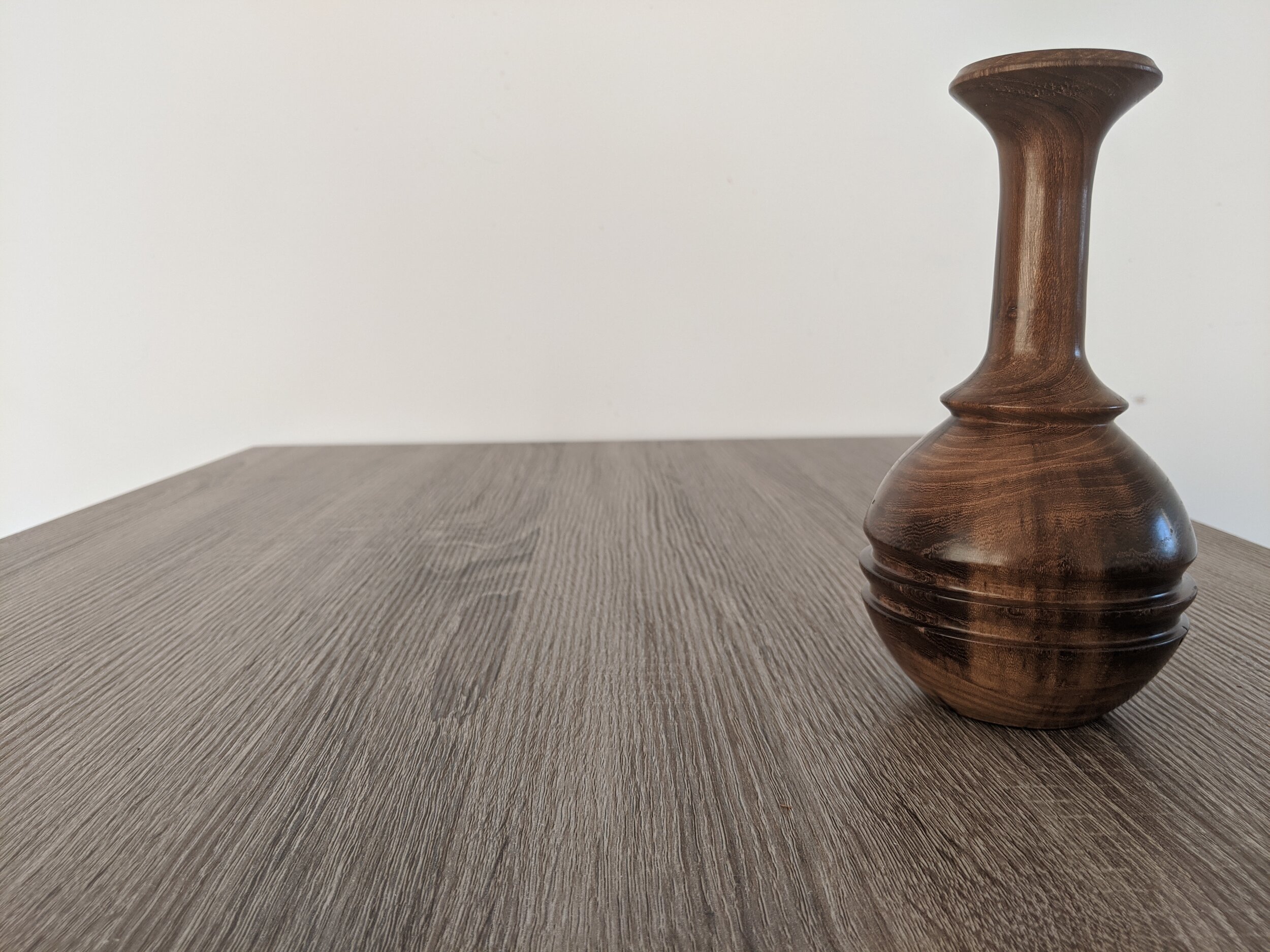
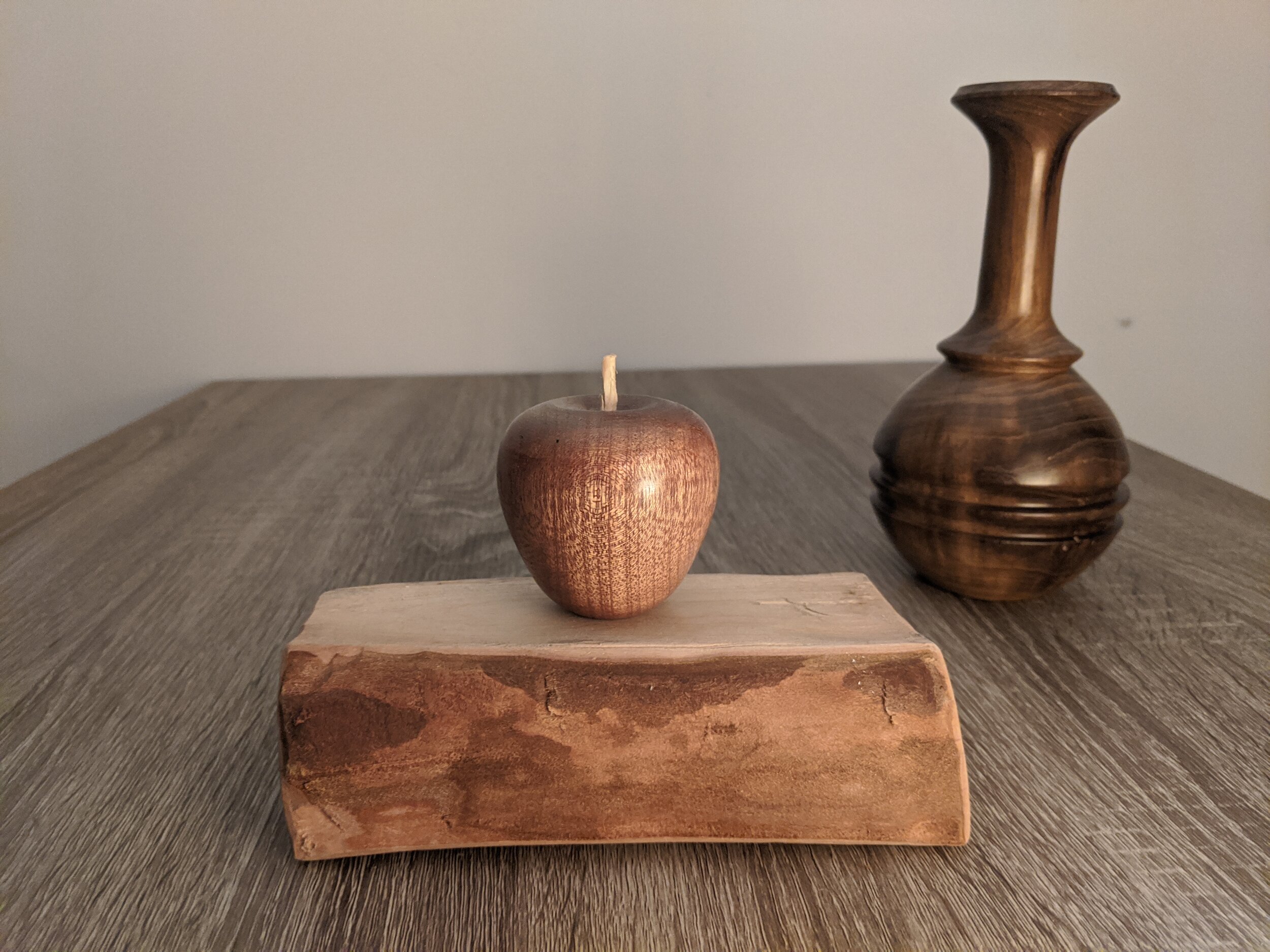
The first photo of the above three, is the main way I have taken the higher quality photos throughout the article. I chose this location as it has a neutral background, and an attractive material.
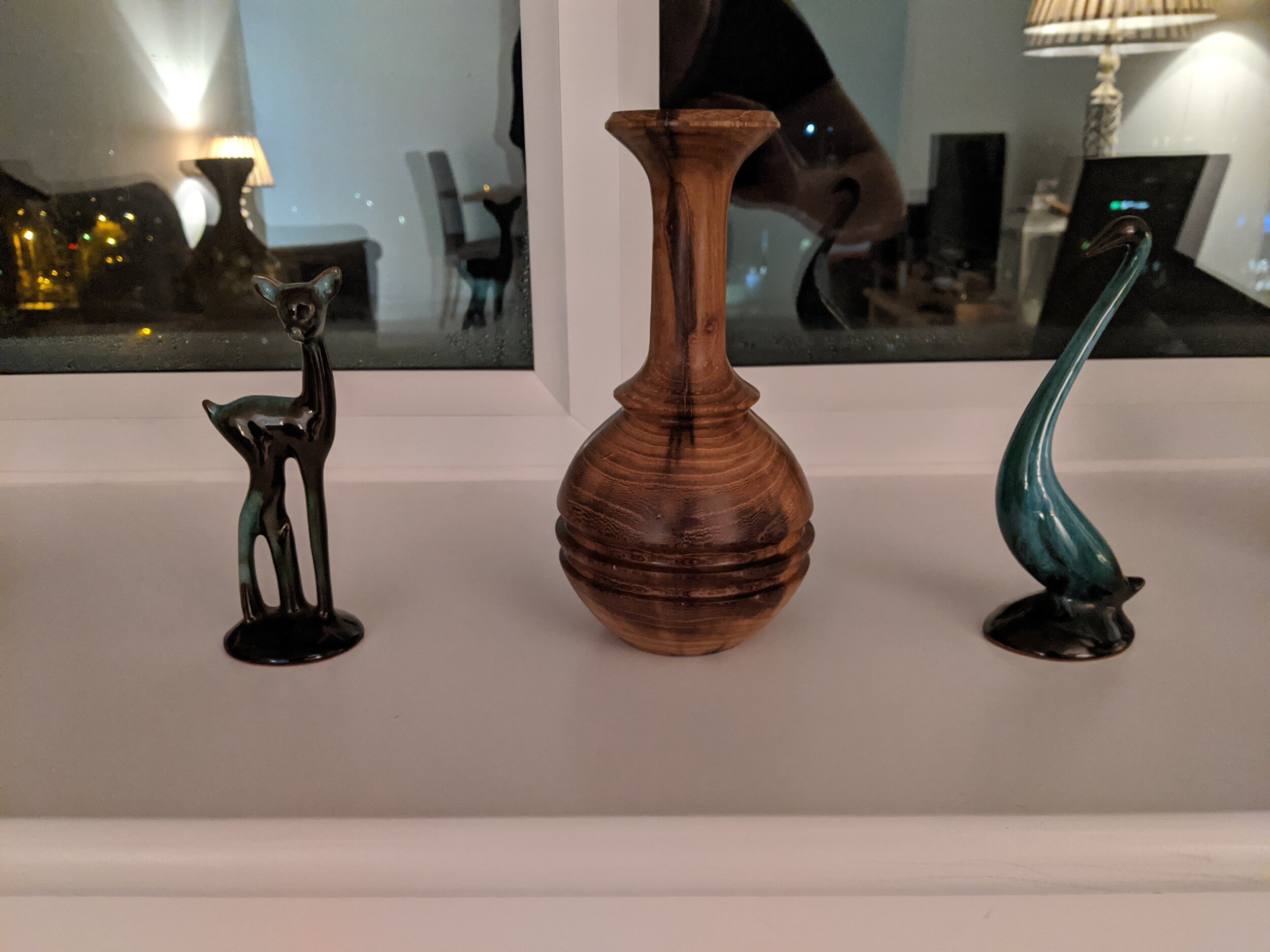
The second photo is the window-sill in my apartment, I don’t think it is a particularly a good place for a photo. The main reason I say that, is the reflection, which creates too much of a distraction from the work piece. Take another look at the photo; you don’t really focus on the piece I’m trying to show, but you’re drawn to the other parts of the photo - the lights, the photographer, what’s on the telly. Not what what you when your trying you show off your work! Also, the photo is off balance, the frame of the window is offset so that the photo feels awkward. I usually see this where people take photos in their workshops, with tools left on workbenches and machines in the background - be careful with this, as people will get distracted and have a look around your shop!
The last photo is of a box which is on our coffee table that we have next to the sofa. I particularly like this photo, as you can see the highlights on the piece of work, and it is well balanced. More on that later.
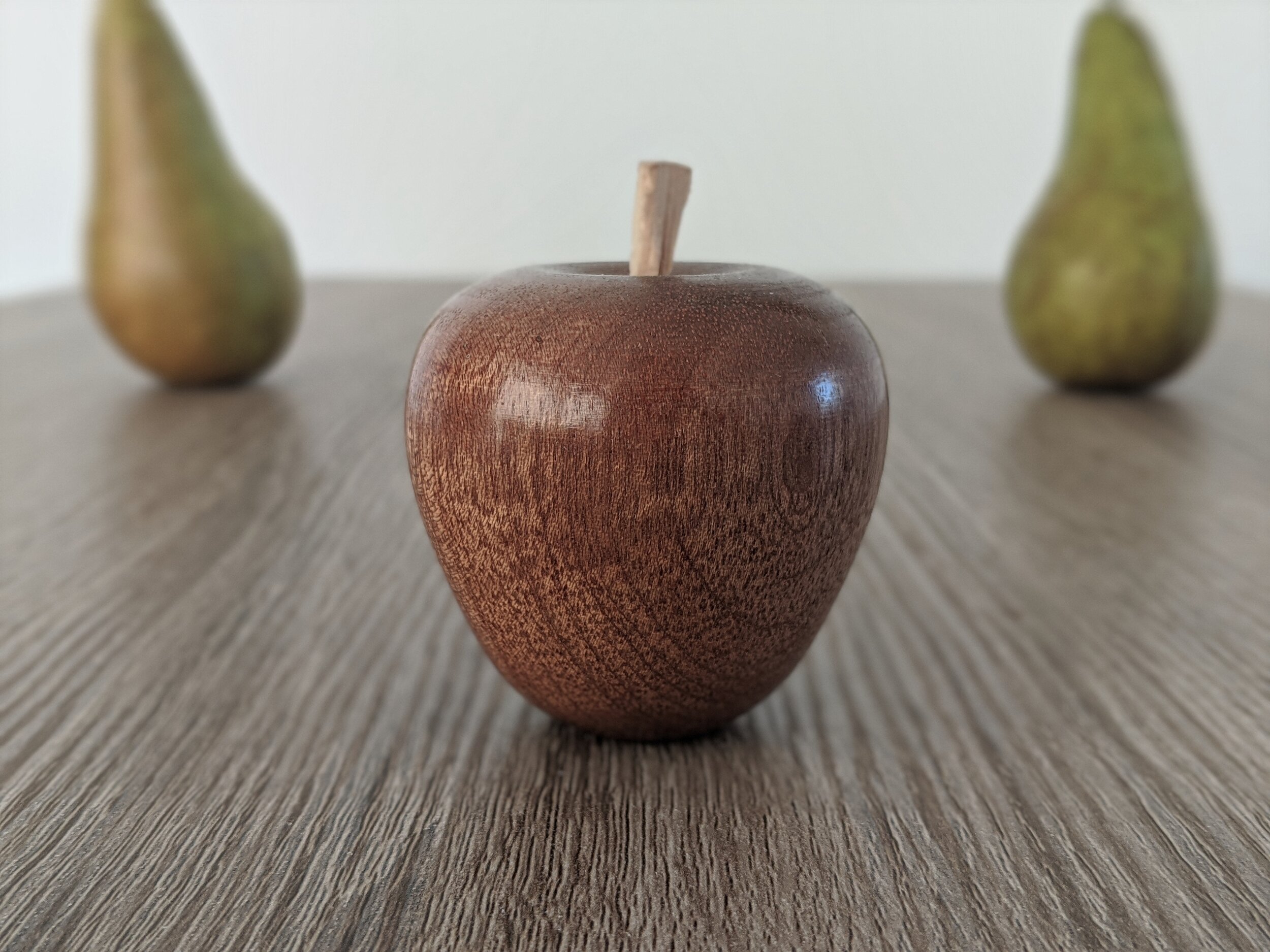
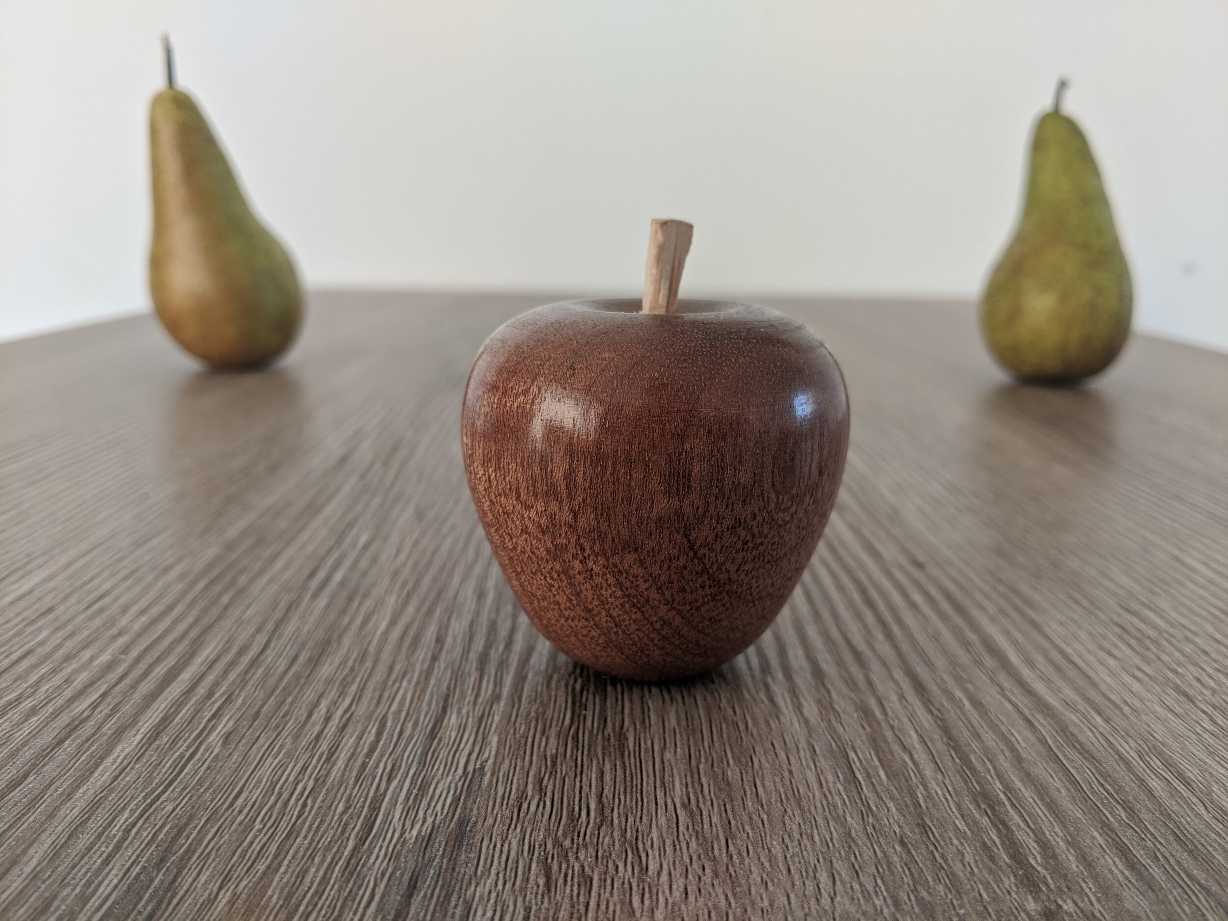
You don’t need to have a specialist set up, or light box, or a specified area. Firstly, find a place where there is not too much happening in the background, or create one with a piece of MDF, or large bit of paper. We have a small dinner table, that I pulled out to take some photos. Aim to have a neutral surface, such as wood, stone, or again, a large bit of paper for the base material. For the background, keep things simple. You don’t want the background to be the focus, or to draw attention away from what you are trying to show. If you do want to add a bit of contrast, try using a plant, or another simple turned item, or a something of a similar vane. You’ll see that in some of my examples of the apple, I use two pears. There is a lovely symmetry with apples & pears. I hope you’ll agree that it is additive feature, and doesn’t subtract from the photo.


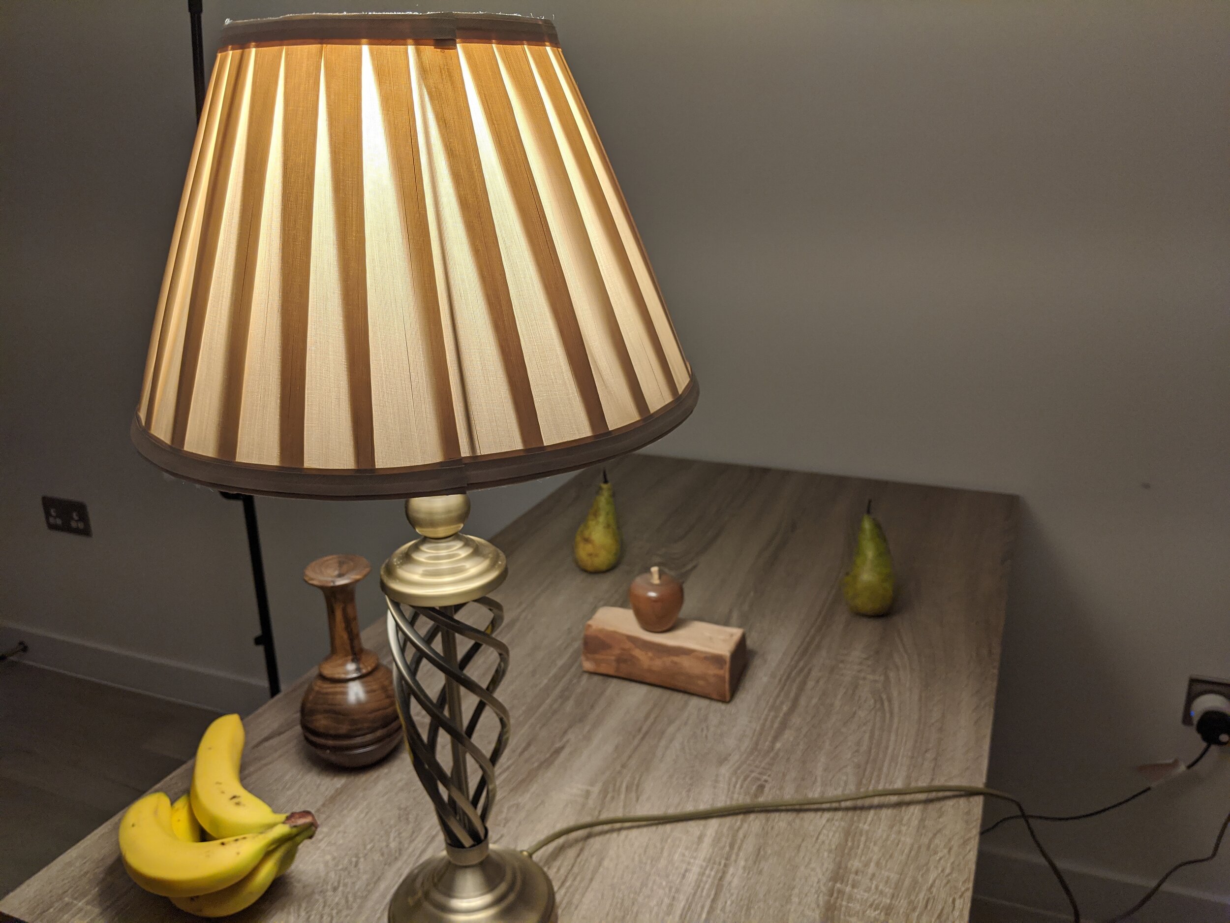
As I write this article, I also spotted another location which might have been suitable - on top of our DVD collection. But I don’t want you looking at my DVDs, detracting from the vase. So by turning it around, I have an option for a photo spot. I hope you’re starting to see the idea now. Have a look around your house, flat, workshop, garden and try taking a few photos and see where your eye falls. If it is on your workpiece, then you’re going in the right direction.
3. Balance - Principle of a third
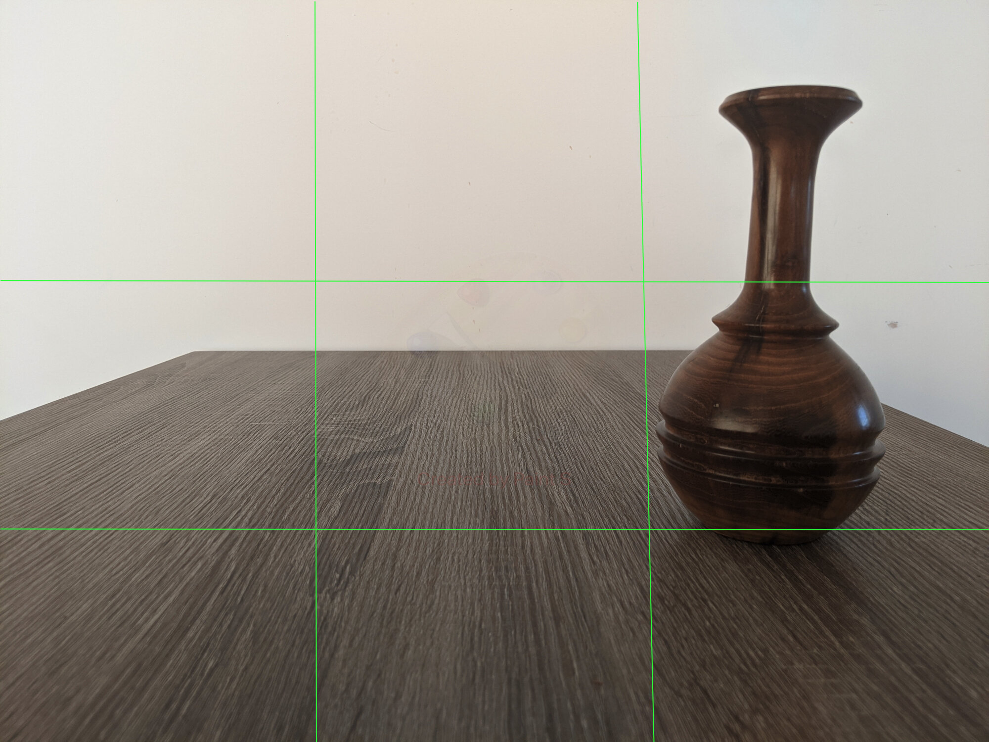
There is a lot to be said for the golden ratio, the Fibonacci sequence, and their appearances in nature and photography. In essence, we can distill a lot of this information into a principle, where the image or focus take up a third of the space, or leaves a third of the image free. There are a number of aids that can help with this; on my smartphone, I use a 3x3 grid to help me line up my photos, and use this to find balance. In woodturning, it is not uncommon to find this principle applied to proportion in shape. There have been a number of demonstrators at Chelmer Valley Woodturning club who have mentioned this, and for good reason; It is an aesthetically pleasing balance. Take for instance, Mark Baker who is very big on design and has studied Greek, Egyptian and other cultures to understand design, Mark always mentioned thirds.
I’ll be talking about the above photos in their respective pairs, where I’ve overlaid a grid on the second photo.
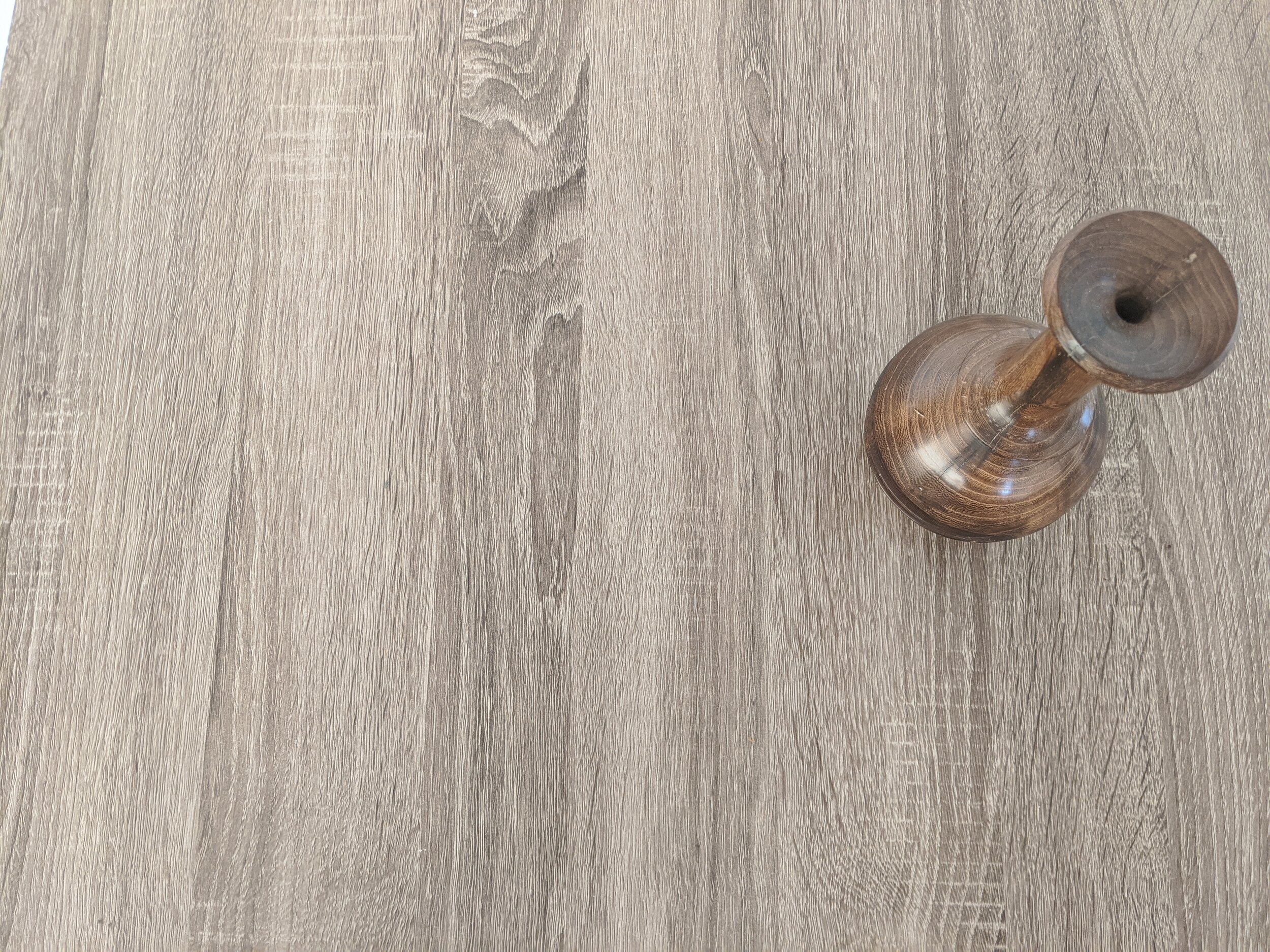
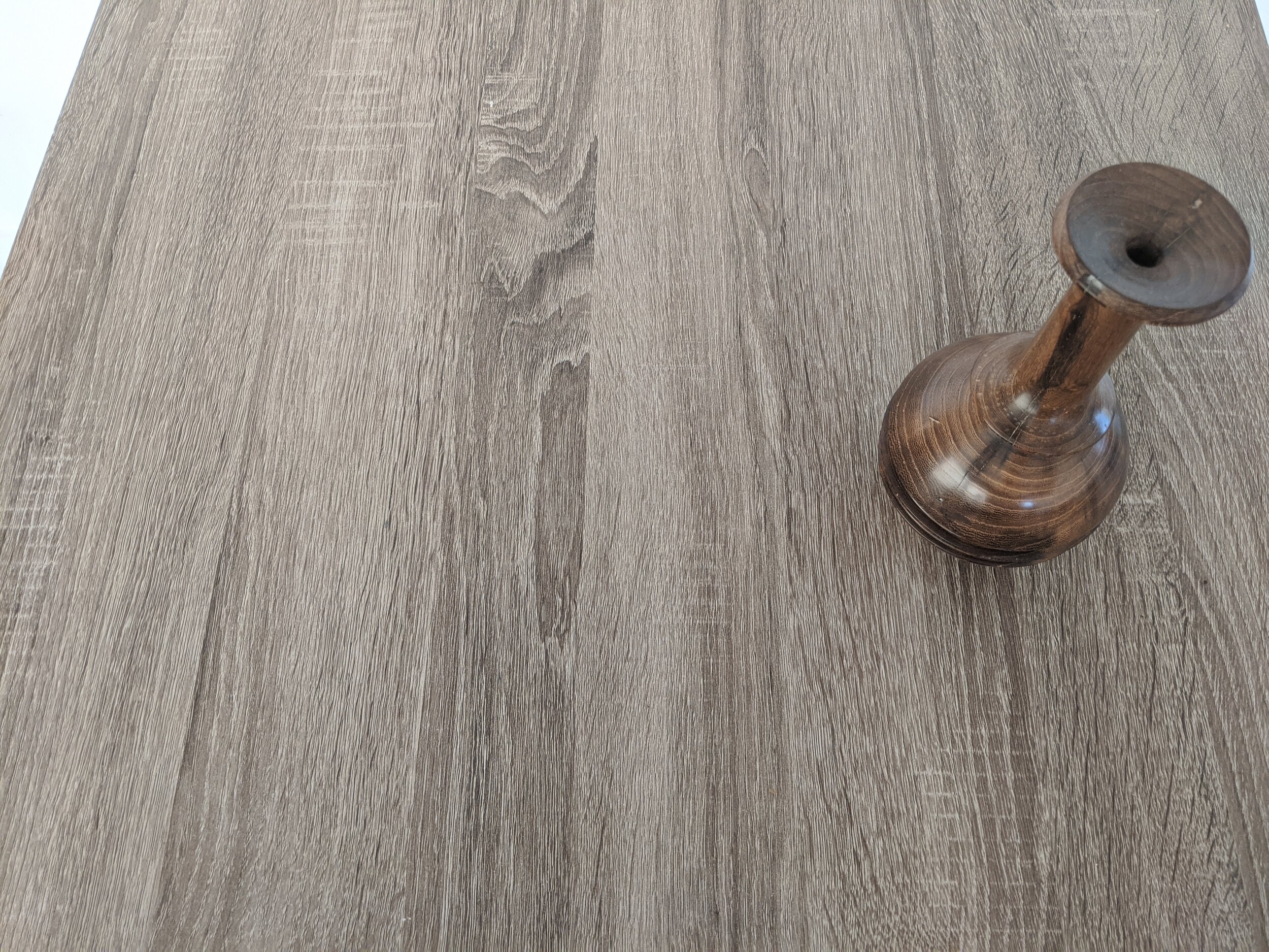
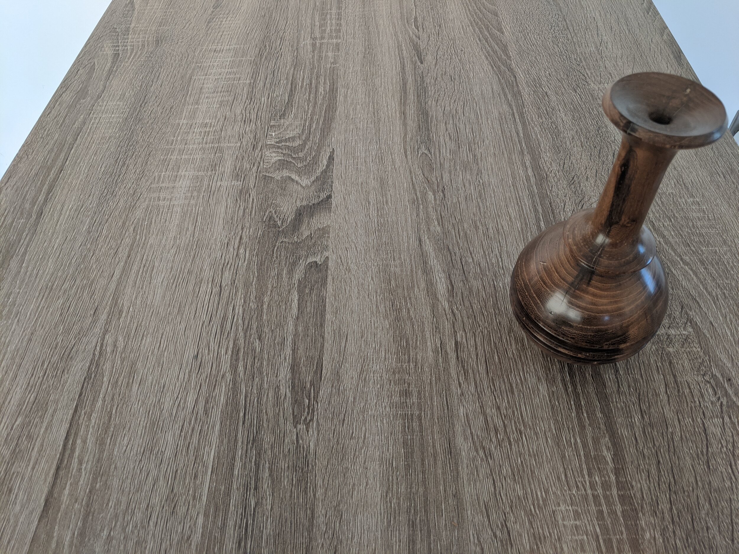
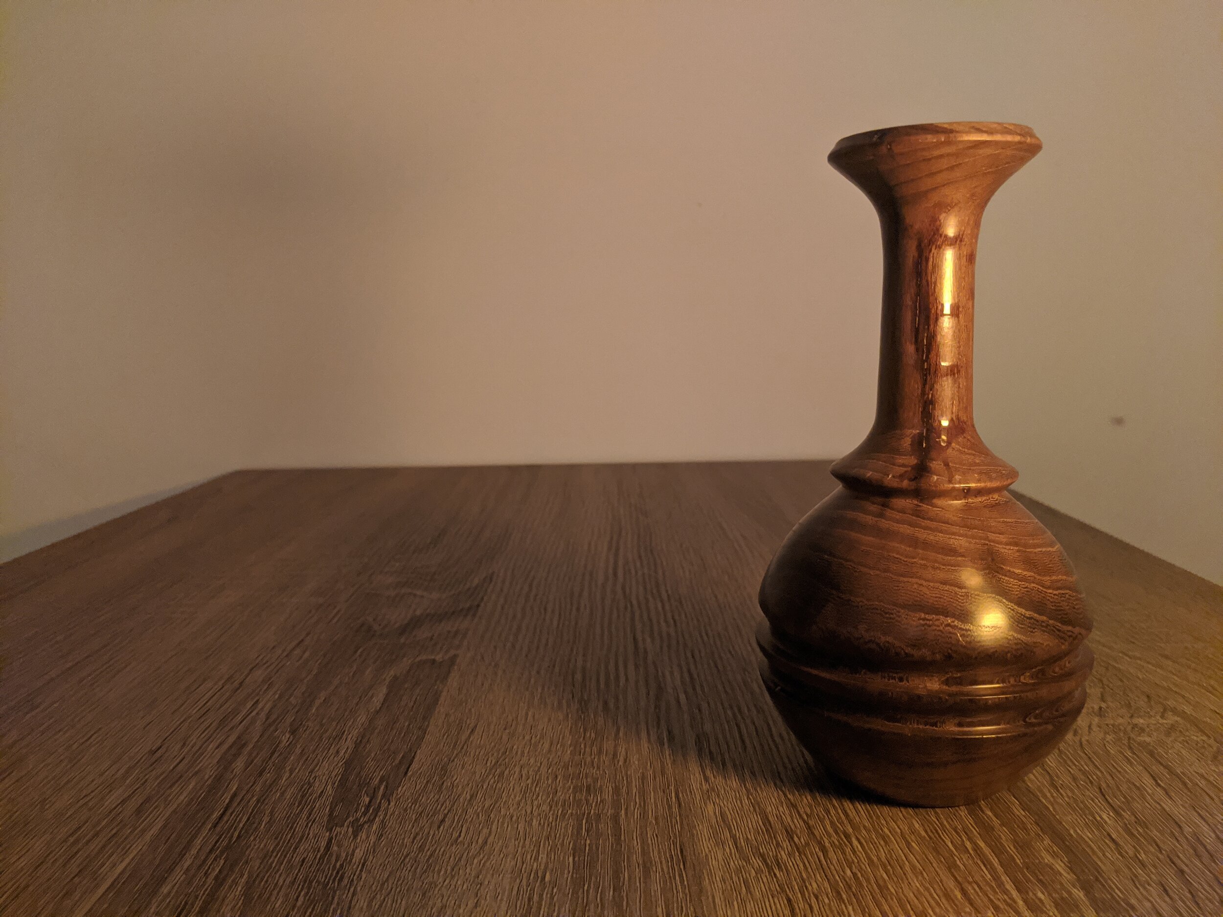
The first photo is where I’ve placed the vase on the right, with two thirds of the photo having ‘empty’ space. Not exactly a third, but we are splitting hairs. The focus is on the vase and creates interest by being off centre. (Note that I am speaking of the thirds vertically). Two thirds of the vertical space has been left ‘empty’. Horizontally, You’ll also see that the bottom third of the picture is left empty - the base of the vase is lined up on the grid line. I find that it is important to have some space between the bottom of the picture and the 'object’, which helps the photo feel balanced. Experiment to see what you like.
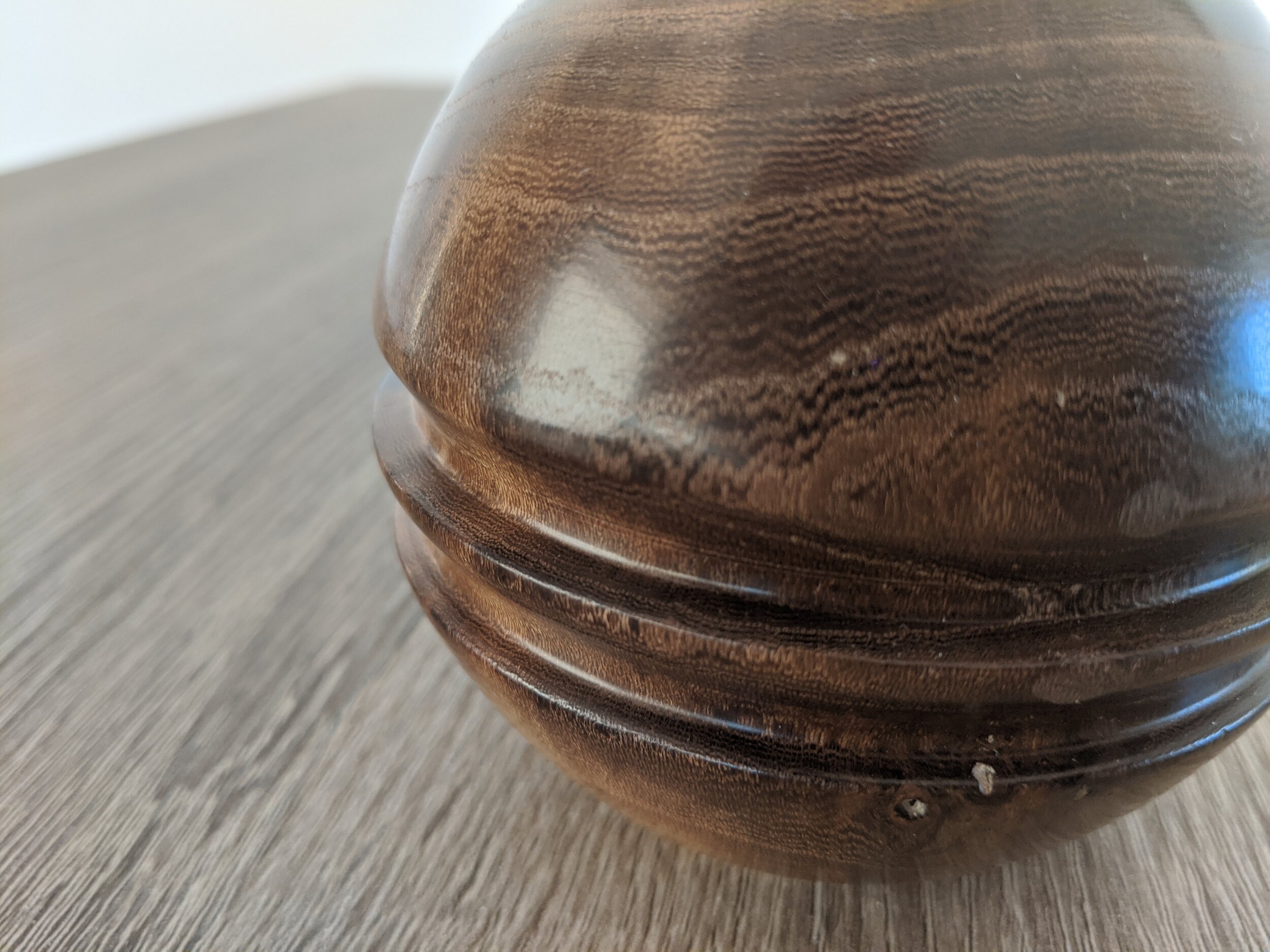
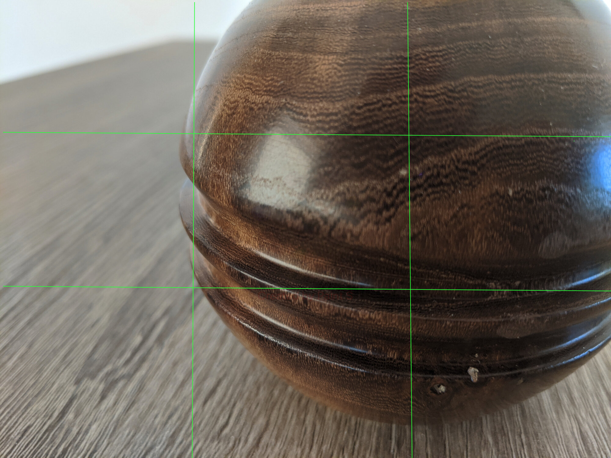
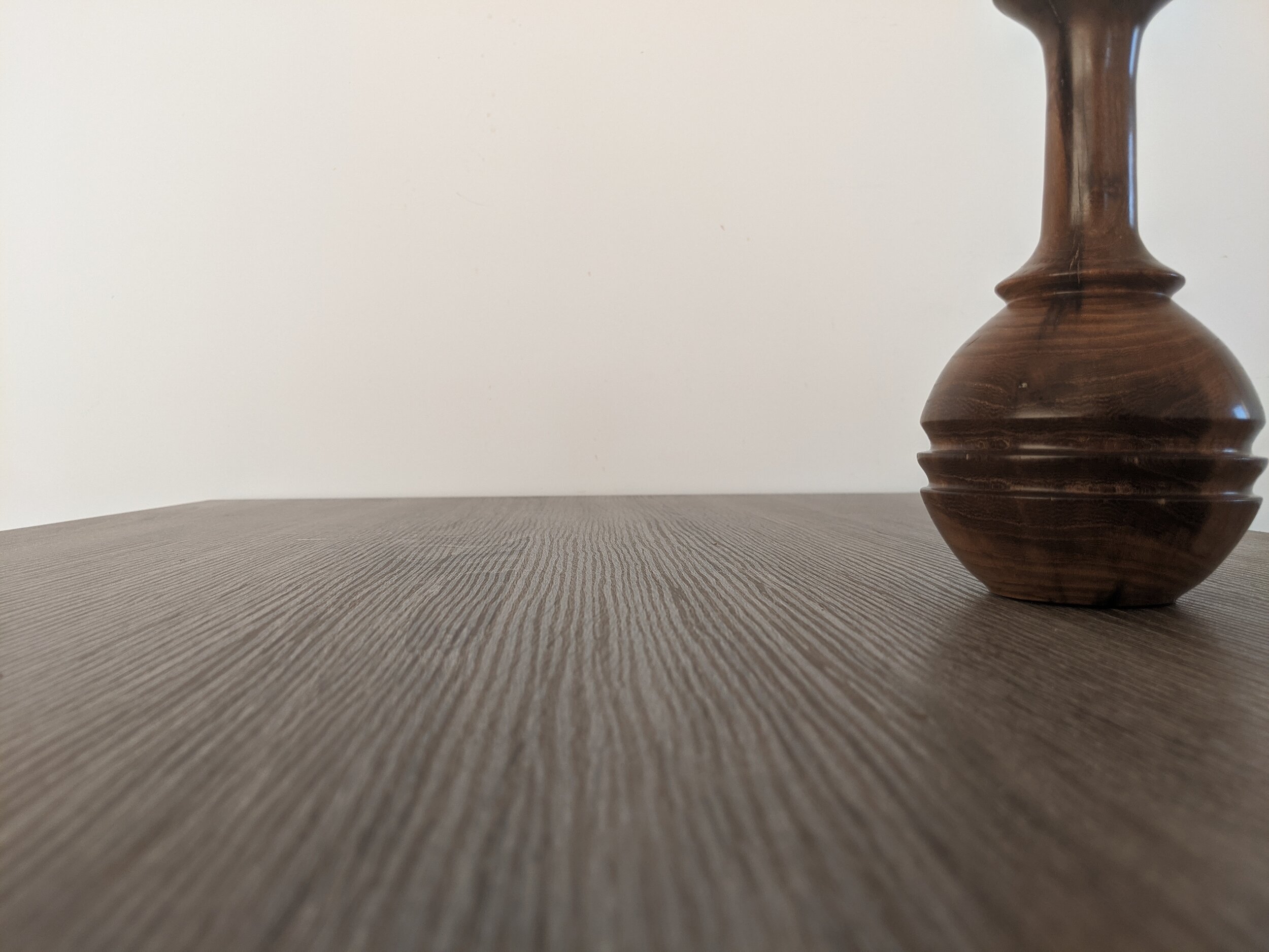
The second photo is the reverse principle of the first photo, where vertically, the vase takes up two thirds of the picture - the left third has been left as ‘empty’ space, giving balance to the photo. Because of the closeness of the photo, it is less important to give horizontal space, the reason for that is that it is intentionally a close up shot. Where the focus is on the detail rather than the overall shape. You’re able to see the grain of the vase, and perhaps determine the finish that has been applied (three consecutive grits of gloss- wax polish if you’re guessing).
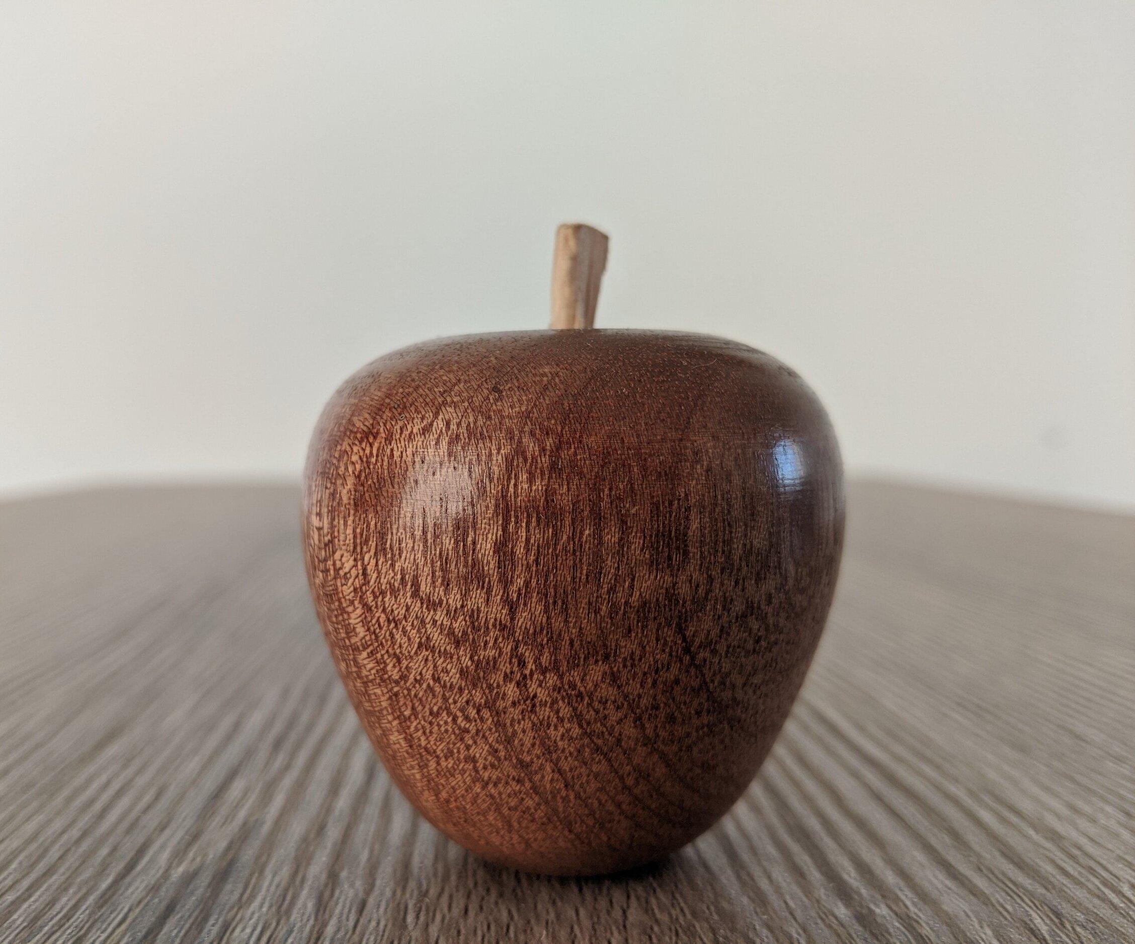
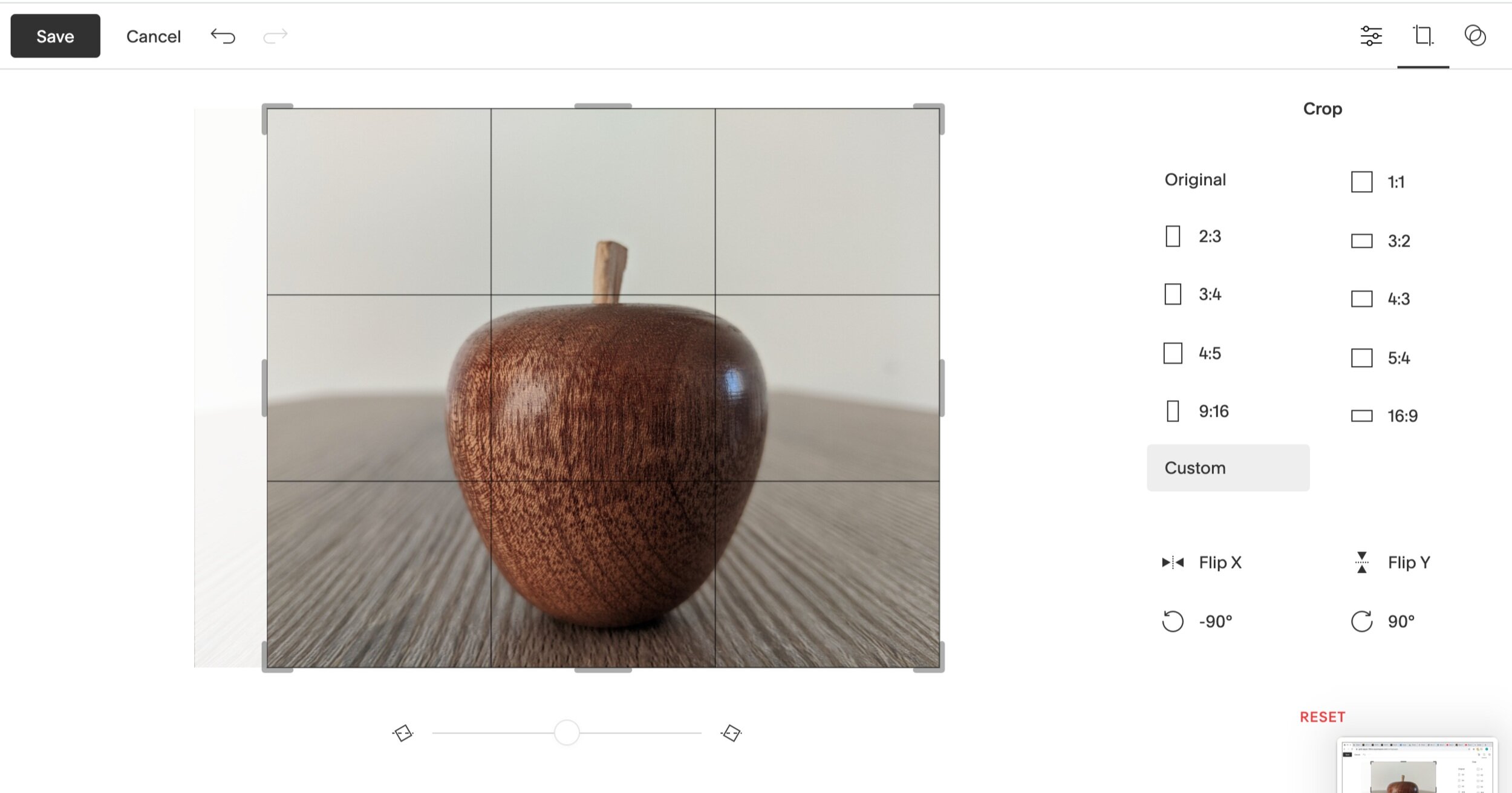
The last photo of the apple, was off centre, and distractingly so; in this case, I had to edit the photo to bring in in to balance vertically. On the editor, you may be able to see that I’ve cropped the left part of the photo to bring the apple into the centre of the photo. The vase majority of the apple is is in the centre and centre bottom of the picture. Vertically, the image is central, with the left and right third being predominantly empty. Horizontally, the top third is majority ‘empty’ space. Again, I’m sure you’ll agree that the photo feels balanced and is pleasant to look at.
A bonus tip is to consider where the grain of the wood is. For the apple, you’ll see that I’ve put the grain at 45 degrees to the camera, showing a different dimension of the wood; you’re able to see the rings of the wood and the spacing change between them as the piece moves from end grain to side grain.


4. Lighting
Quite possibly the most important consideration on this list is lighting.
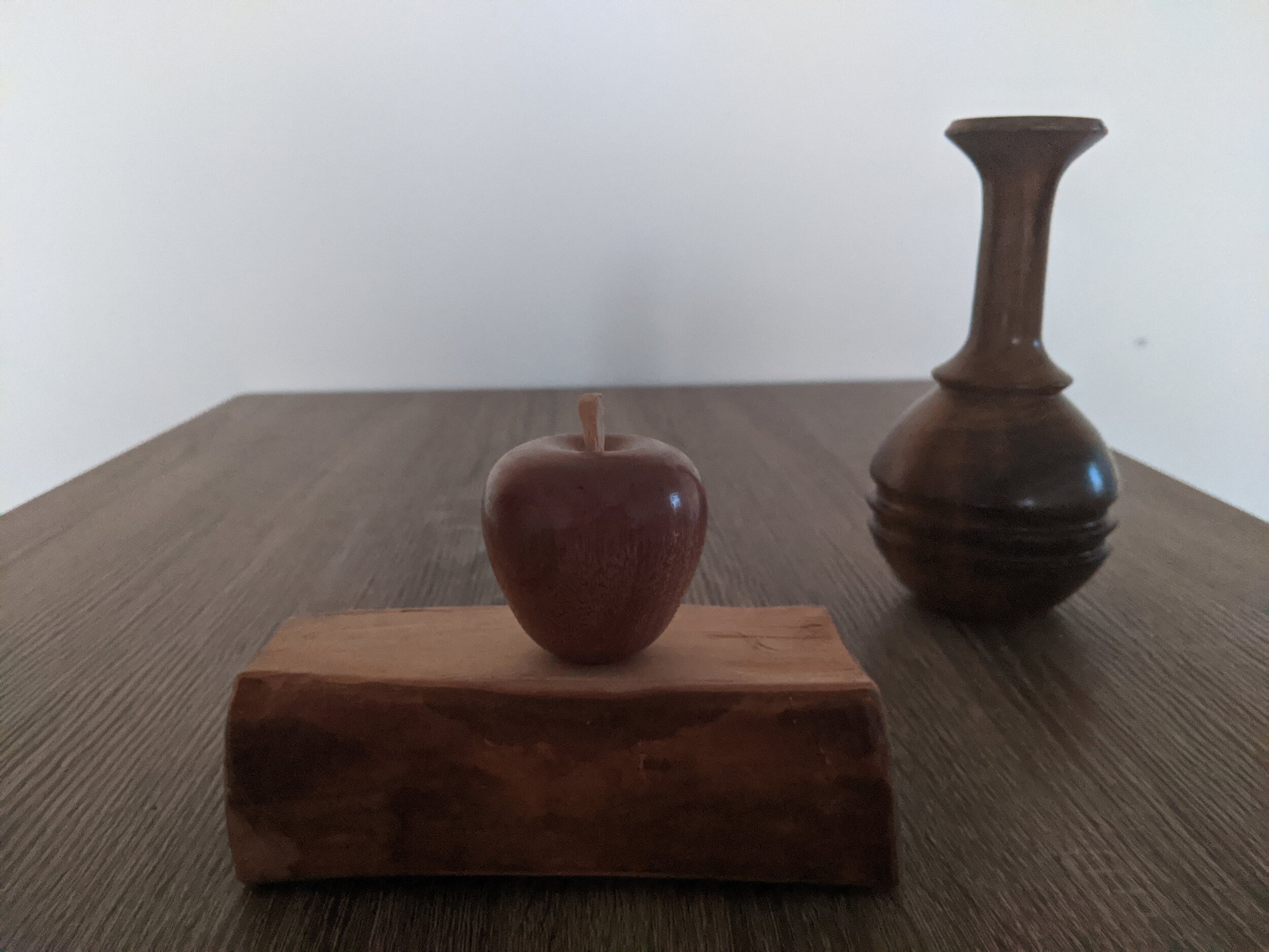
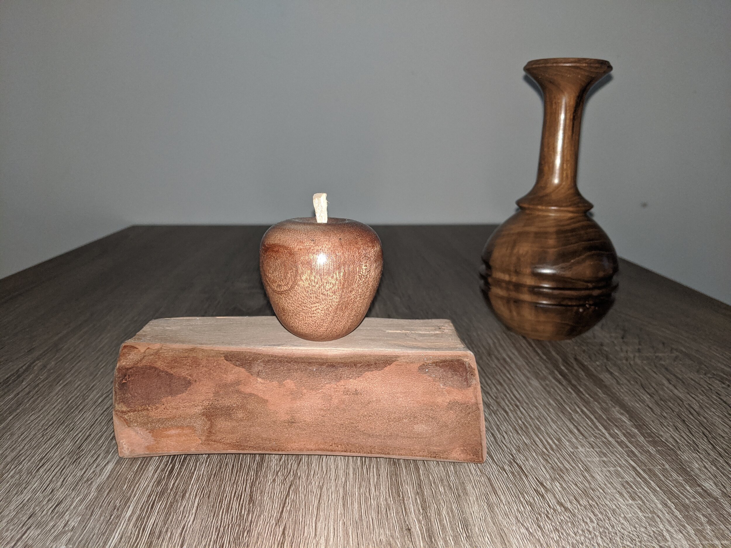
It seems quite simple but you would not believe the amount of photos I see where the main source of light is behind the object. I’ve shown two examples above, where you can see the immediate difference lighting makes. The first is of the vase, where all that has changed is the the position of the lamp. You’ll note that where the lamp is in front of the vase, that the details is more clearly made out.
In a more extreme example in the first of the apple photos, the main source of light is from the sunset, you’ll see that you make out the reflections in the window more readily; there is a lack of detail and the photo looks like someone one has been over it with a bit of 240 grit, giving it a ‘grainy’ look. For the other apple photo, I used flash; I seldom use flash, as I much prefer to use an alternate light source, or natural light. The reason for that is there is generally too much light, and it doesn’t diffuse very well, creating harsh reflections. In this case, the photo came out quite well. Some other examples below do not come out quite as well.
Let’s take a look at these three photos. The first is taken at 08:30pm with the fading natural light. The second is taken with flash, and the third is with a lamp.
The first photo has insufficient light to produce any detail. Therefore you can’t make out any of the character of the wood, and some of the shape becomes fuzzy. You can’t see any of the clear lines of the piece.
The second photo is better, however, the reflection of the light is harsh. You lose depth to the photo as the light is coming straight from the camera. The photo feels flat to my eye.
The last photo is using a lamp as the source of light.
You’ll see here, that I’ve use a wedding invite (don’t tell the missus) as a filter. A generic piece of paper would do sufficiently, but this invite gave a gentle purple tone to the photo which you wouldn’t necessarily notice in the photo.

Try using different papers, and coloured papers to diffuse the light.
You’ll see because of this, there is a shadow on the back side of the apple, giving a depth to the photo, not seen in the photo with the flash. You’ll also see that there is more vibrancy in the photo because of the less harsh light.

Consider this photo without the improvise diffuser.
The shadow creates a bit more interest in the photo, but again the reflections are harsh, and I think that it detracts from the photo. The brightness reduces the level of detail caught as well.
To surmise the lighting;
Do use lamps, consider their placement onto the object and try diffusing the light. Natural light, an hour or so before sunset is a good time to take a photo, where the light isn’t as bright as midday, but allows most cameras to capture the detail, creating a warmer picture. Make sure you experiment!

You could try up ending the lamp to get photos well lit.
Don’t use your house lights or workshop lights, especially florescent light which does not come across well on a photo. Try not to use flash, it make work in a pinch, but nine times out of ten, using an alternative light source will give better results.
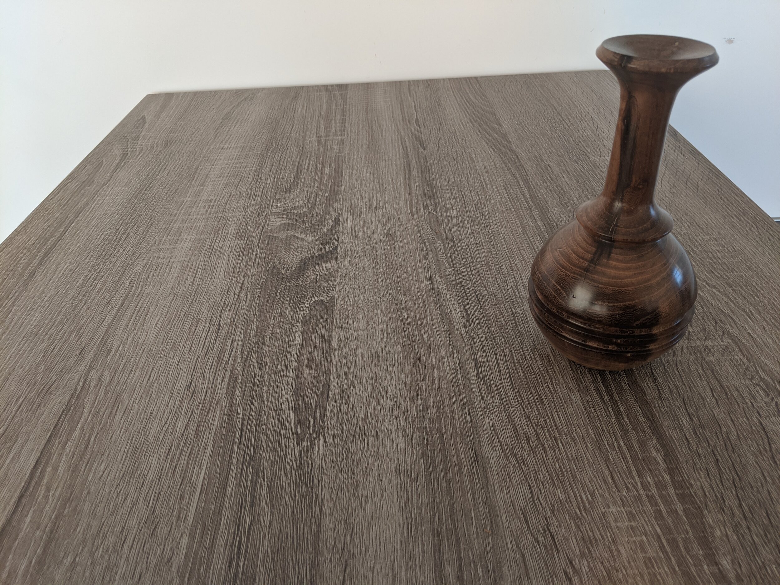

5. Angles

Regardless of the angle of the shot, make sure your focus is right! On most smart phones, you can tap your screen where you want your camera to focus.
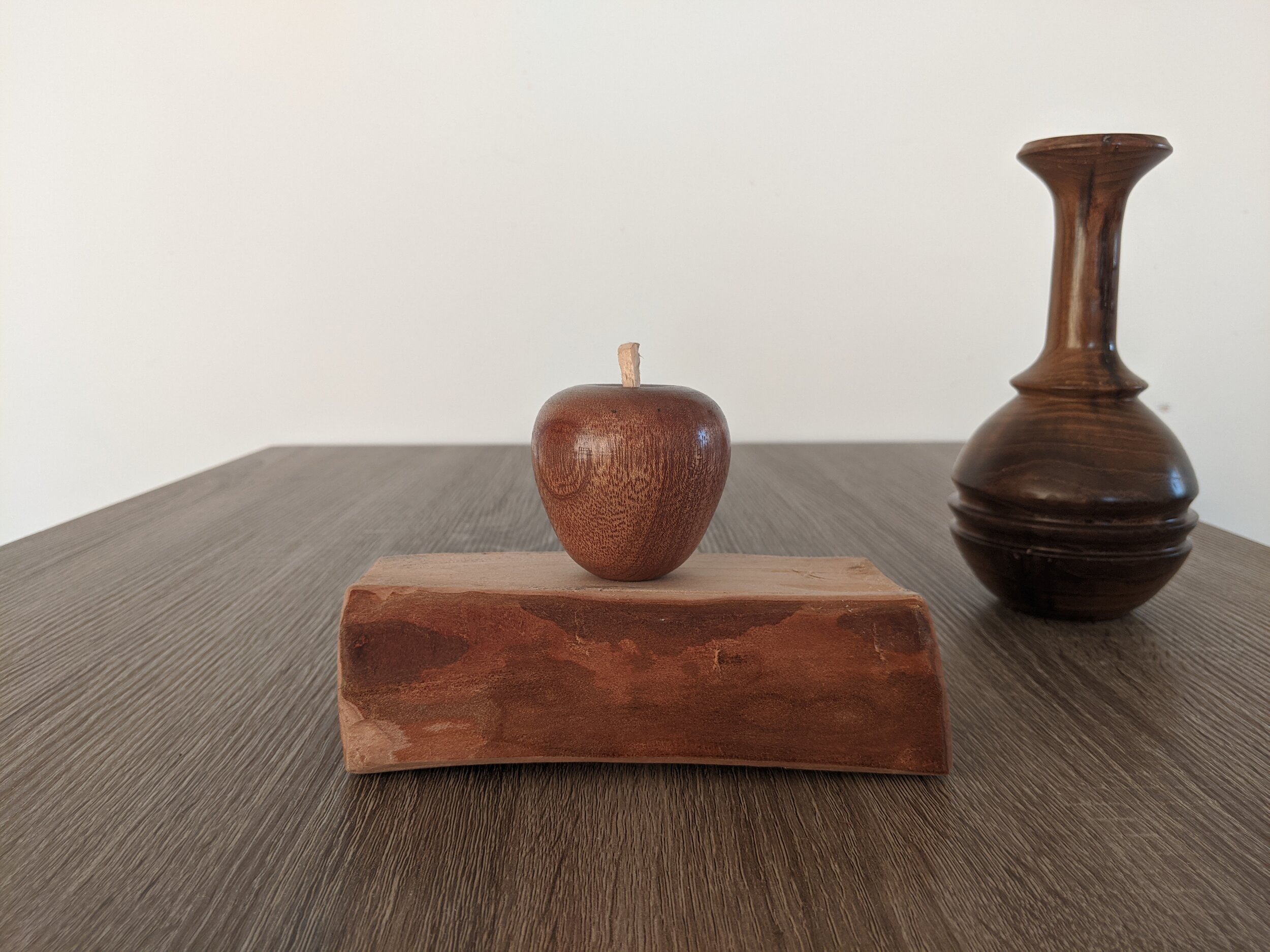
Typically, I see a lot of photos where the photo is being taken from standing up, down on the project. Such as in photo four. Consider taking a photo where the camera is perpendicular to the project. Considering the principle of thirds will help with this immediately. You’ll see that I’ve chosen to take photos where the vase is offset. I hope you’ll agree that the last photo is better aesthetically; it at an angle where the camera captures the full scale of the image, and is well balanced. You may have seen in some of my photos, that I’ve raised the apple on a block of cherry. This is to create another element to the photo, and create a different angle to take a photo. You may see at exhibitions that some turners put their objects on a nice piece of wood. I’m told that it increases the value of the object immediately. I’ll let you be the judge.
In closing
I hope that you found that this article has given you some ideas when taking photos, not only of your projects, but any photo that you take. These principles all have some value when taking a photo. This is a starting point; if it interests you, I highly recommend that you take a course that will build on these principles.

Take a number of photos and decide which one is best, try new angles, try different lights. You’ll be surprised at the difference. Going back to the opening segment where I mention about taking a photo and looking at it for three seconds, aim to take such a good quality of photo that someone will want to look at it for more than ten seconds. Take a look through your woodworking books to see this in action, you’ll notice some of these principles applied.
What if I have unsteady hands, and I find it difficult to take photos? Well fear not! I have a few suggestions for you. Try placing two elbows on the surface of the object you’re looking to take, or use the back of a chair to support. You may also find benefit in using a cushion to rest on. Another alternative, is to use a countdown timer on your camera, and then place it on a something that gets the angle you like. Finally, some devices (mainly smartphones) have a ‘burst’ mode where a number of photos are taken in a very short period, allowing you to select your favourite.
You don’t need expensive equipment to take a good photo. My phone is considered ‘out of date’ compared to newer devices, (it’s a Google Pixel 2 if you’re wondering) but I’ve still been able to take great photos from it. Smartphones have come a long way, and most are more than sufficient to get a good photo out of.
A note on post processing - This is a whole different kettle of fish which is an article in itself. For some of my photos, I will play around with it, but very rarely. I have set my smartphone that it boosts saturation by 10% on every photo and I find that gives great results.
Any questions, please feel free to email me at Fromtreetoturned@gmail.com - Please check out my website for more of my work at fromtreetoturned.com